We've all heard the old saying: Don't judge a book by its cover.
It's wonderful advice when we're talking about people.
When we're talking about actual books? I'm not so sure.
Walk through a bookstore and notice what makes you stop. Scroll through Amazon and pay attention to which books make you pause. Before you've read the description, checked the reviews, or clicked "Look Inside," something has already influenced you.
The cover.
Readers may not consciously say, "I'm evaluating the typography, color palette, imagery, and visual hierarchy of this book." But they're responding to those things anyway.
Your cover is making a promise before your first sentence ever gets a chance.
And for independent authors in particular, that makes cover design much more than a creative decision.
It's a marketing decision.
Your Cover Has a Job to Do
I think authors sometimes put too much pressure on a cover to explain the entire book.
It doesn't have to.
A good cover needs to do something much simpler:
Make the right reader stop long enough to want to know more.
That's an important distinction.
Reedsy's current cover-design guidance recommends that authors signal genre, decide what they most want the cover to communicate, establish a strong focal point, use legible typography, and get feedback from the right readers.
IngramSpark makes a similar point: readers should be able to get a sense of a book's genre, audience and tone from its cover.
In other words, a beautiful cover isn't necessarily an effective cover.
It has to communicate.
Start With the Reader, Not the Author
This can be difficult because authors are incredibly close to their books.
We know every character.
We understand every metaphor.
We know why a particular flower, photograph, building, color, or object is deeply significant.
The person seeing our book for the first time knows none of that.
So instead of beginning with:
"What do I want on my cover?"
Try beginning with:
"What do I want my ideal reader to feel when they see my cover?"
Curiosity?
Hope?
Suspense?
Comfort?
Excitement?
Possibility?
Romance?
Authority?
Transformation?
That answer gives you a much stronger starting point.
Look at the Books Sitting Beside Yours
Here's one of the simplest exercises I recommend.
Go to Amazon, Barnes & Noble, a local bookstore, or your favorite online bookseller and find books that would realistically sit beside yours.
Not books you personally admire.
Books competing for the attention of the same reader.
Look at 10 or 20 of them together.
What colors appear repeatedly?
Are the covers photographic or illustrated?
Is the typography bold or delicate?
Are people shown?
How much text appears on the cover?
What emotions do the covers convey?
Are nonfiction titles dominated by typography? Do thrillers use darker palettes? Are certain romance subgenres using illustrated characters while others rely on photography?
You aren't looking for something to copy.
You're learning the visual language your readers already understand.
Reedsy specifically recommends researching successful books within your genre and studying the visual cues readers associate with those books.
There's a balance here.
Your cover should look different enough to get noticed but familiar enough that the right reader recognizes, "This might be for me."
Real-Life Example: The Expectant Author
My own book gave me an interesting challenge.
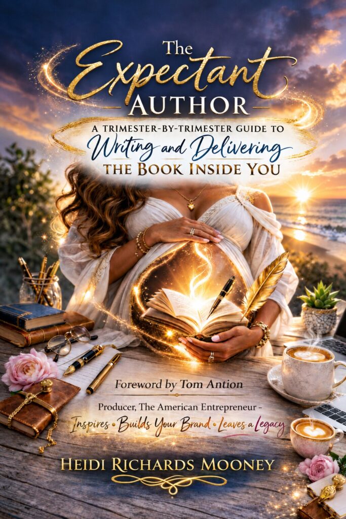
The Expectant Author: A Trimester-by-Trimester Guide to Writing and Delivering the Book Inside You uses pregnancy as a metaphor for writing and publishing a book.
The entire concept is built around nurturing an idea, moving through developmental stages, preparing for delivery, and eventually bringing your book into the world.
So the cover needed to communicate that metaphor.
But there was another challenge.
The book isn't actually about pregnancy.
It's about writing.
That meant the visual concept had to connect both worlds. The imagery needed to suggest expectancy and creation while books, writing elements, typography, and the subtitle made the true subject clear.
That is an important cover-design lesson in itself:
The cleverest part of your concept shouldn't confuse the reader about what kind of book they're buying.
Your cover and subtitle need to work together.
The Thumbnail Test
This may be one of the most overlooked tests in modern book publishing.
Shrink your cover.
Really shrink it.
Look at it at approximately the size it might appear while someone is scrolling through an online bookstore.
Can you still read the title?
Can you recognize the main image?
Does anything stand out?
Or does everything turn into a tiny blob?
Reedsy's cover-design guidance specifically recommends testing covers at thumbnail size because online shoppers frequently encounter books that way.
This is one of those places where authors sometimes have to let go of details we love.
That gorgeous little element may be meaningful at full size and completely invisible at thumbnail size.
If readers can't see it, it can't help sell the book.
Don't Make Everything Important
One of the easiest ways to weaken a cover is to try to make everything stand out.
The title.
The subtitle.
The author's name.
The image.
The endorsement.
The award seal.
The series name.
The tagline.
The foreword.
When everything is shouting, nothing is being heard.
Your cover needs hierarchy.
Ask yourself:
What should the reader notice first?
Then what?
Then what?
IngramSpark's guidance similarly cautions against clutter and recommends a clear hierarchy so readers encounter the most important message first.
Sometimes removing something improves a cover more than adding something.
Ask the Right People for Feedback
Authors love asking:
"Which cover do you like best?"
I'd change the question.
Instead, show someone the cover briefly and ask:
What do you think this book is about?
Or:
Who do you think this book was written for?
Or:
What kind of book would you expect this to be?
Those answers are much more useful.
You don't necessarily need people to like your cover.
You need the right people to understand it.
IngramSpark even suggests creating multiple cover concepts and polling readers, while noting that the feedback itself can reveal useful information about the audience and positioning.
And don't only ask family and friends.
Your mother loving your cover is wonderful.
Your ideal reader understanding your cover is marketing.
Real-Life Example: When a Cover Needs to Sell the Genre First
Imagine two authors have written historical novels set during World War II.
One is primarily a sweeping romance.
The other is a tense espionage thriller.
They share the same historical period, but their covers probably shouldn't look alike.
A couple embracing against a European backdrop might immediately communicate romance.
A shadowed figure, coded document, train platform, or stark typography might signal espionage.
Neither approach is inherently better.
The question is whether the visual promise matches the reading experience.
IngramSpark uses a similar example when discussing books that straddle historical fiction and romance: the cover should help readers understand which aspect of the story dominates.
That's why knowing your genre isn't enough.
You also need to know your subgenre, tone and reader expectations.
Real-Life Example: The Cover You Love May Not Be the Cover You Need
Here's a scenario many authors encounter.
An author loves a beautiful photograph—a sunset, a flower, a landscape, perhaps something personally connected to the story.
It's meaningful.
It's gorgeous.
And it tells a prospective reader absolutely nothing.
That's when an author has to separate personal attachment from marketing effectiveness.
That photograph might belong inside the book.
It might make wonderful social-media content.
It might even inspire elements of the cover.
But the front cover has a specific job.
Sometimes the best creative decision is not asking:
"What do I love?"
but:
"What will help my reader recognize that this book is for them?"
Five Questions to Ask Before Approving Your Cover
Before you say, "That's it!", give your cover one final test.
1. Can I tell what kind of book this is?
Your genre shouldn't require detective work.
2. Can I read the title as a thumbnail?
If not, rethink size, typography or contrast.
3. Does the cover create the right emotional expectation?
A funny book shouldn't look frightening. A thriller shouldn't accidentally look like a devotional.
4. Is there one clear focal point?
Give the eye somewhere to land.
5. Would this cover look at home beside successful books written for the same reader?
Not identical. Not derivative. But recognizably part of the same marketplace.
If you can answer yes to all five, you're probably moving in the right direction.
Resources Worth Exploring
Authors don't have to figure this out alone.
Reedsy has extensive free resources on cover research, genre conventions, design principles, typography, thumbnail testing and working with professional designers. Their cover gallery can also be useful for studying professionally designed books across genres.
IngramSpark offers free educational material covering front-cover design, genre expectations, audience, typography, trim sizes, print specifications and other practical considerations—particularly helpful if you're independently publishing print editions.
And don't overlook one of the best resources available:
Your readers.
Create two or three possibilities and show them to people who actually read your genre. Don't just ask which is prettiest. Ask what each version communicates.
Their answers may surprise you.
Your Cover Is Part of Your Book's Story
We spend months—and sometimes years—writing our books.
Then comes the moment when all those words need a face.
That's what your cover becomes.
It doesn't have to tell the whole story.
It shouldn't.
It simply needs to make a promise about what's waiting inside—and make that promise to the right person.
So yes, maybe we shouldn't judge a book by its cover.
But readers do.
And rather than wishing they didn't, authors can use that reality to our advantage.
Create a cover that makes someone pause.
Create one that creates curiosity.
Create one that feels true to the book you've written.
Most importantly, create one that makes your ideal reader think:
"I want to know what's inside."
Now I'd Love to Hear Your Cover Story
How did you come up with the idea for your book cover?
Did you know exactly what you wanted from the beginning? Did your designer take you in an unexpected direction? Did you test several versions? Or did your cover evolve right along with your manuscript?
Share your cover and tell us the story behind it.
Because every book has a story—and sometimes, the story of the cover is almost as interesting as the story inside.
Ps. The image for this post features one rendition of my book. Below is the final book cover my team and I decided on:
Is Your Book Cover Really “The One”?
You’ve seen what a powerful book cover can do. Now it’s time to take a closer look at your own.
Download The Book Cover Checkup: 10 Questions to Ask Before You Say, “That’s the One.” — a free practical resource from The Author Collab designed to help you evaluate your cover through the eyes of your readers.
Inside, you’ll discover practical exercises including the 3-Second Test, Thumbnail Test, Virtual Bookshelf Test, Reader Feedback Test, and our Ready, Refine, or Rethink worksheet—plus a final technical checklist to complete before you upload your cover.
Whether you’re choosing your first cover, considering a redesign, or simply wondering if your current cover is doing its job, The Book Cover Checkup will help you look at it with fresh eyes.
Your readers are going to judge your book by its cover.
Make sure you’re giving them a reason to take a closer look.
[DOWNLOAD THE FREE BOOK COVER CHECKUP →]
From The Author Collab — More Readers. More Impact. Together.