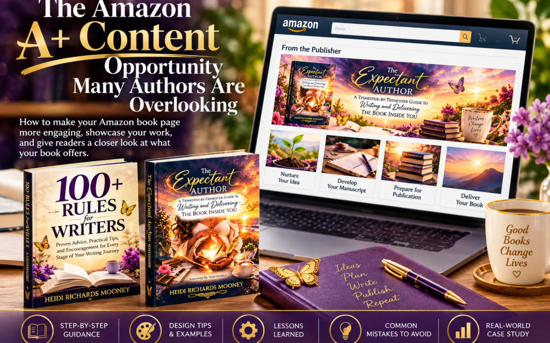
How to make your Amazon book page more engaging, give readers a closer look at your work, and create A+ Content that reflects your author brand.
Your Book Deserves More Than a Basic Listing
You've spent months, perhaps years, writing your book. You've revised chapters, selected a cover, crafted your description, and finally clicked Publish.
Then comes the next challenge: helping potential readers understand why your book deserves their attention.
Most authors concentrate on the familiar elements of an Amazon book listing: the cover, description, categories, keywords, and reviews. Those are important, but there's another opportunity that deserves a place in your book marketing toolkit.
It's called Amazon A+ Content, and until recently, it was something I hadn't fully explored for my own books.
After creating A+ Content for two of my writing guides, I began wondering how many other independent authors were overlooking this opportunity.
The experience taught me something worth sharing: your Amazon book page doesn't have to rely on words alone to communicate what makes your book special.
What Is Amazon A+ Content?
Amazon A+ Content is a feature available through Kindle Direct Publishing (KDP) that allows authors and publishers to add enhanced images, formatted text, and certain comparison charts to their Amazon book detail pages.
Instead of relying entirely on the traditional book description, you can create a more visual presentation that helps readers explore your book's subject, benefits, themes, and unique qualities.
A+ Content typically appears in the From the Publisher section of an Amazon book listing, farther down the page.
Think of it as an opportunity to give potential readers a guided introduction to your book.
For nonfiction authors, that might mean highlighting key lessons, frameworks, or the transformation readers can expect.
For fiction authors, it could mean introducing the story world, conveying the atmosphere, or offering readers a glimpse of the characters and themes.
For children's book authors, it might involve showcasing illustrations and the reading experience.
The goal isn't simply to make your listing prettier. It's to help readers understand what your book offers before they decide whether it's right for them.
Why Authors Should Pay Attention
A+ Content gives authors several opportunities that a conventional book description cannot always provide.
It helps your book stand out visually. Thoughtful images, headlines, and consistent design can create a more memorable browsing experience.
It makes complex information easier to understand. If your book teaches a process, presents a framework, or includes multiple sections, visual storytelling can help readers grasp its value quickly.
It reinforces your author brand. Your colors, typography, imagery, and tone can create continuity between your book cover, website, promotional materials, and Amazon listing.
It answers questions before readers ask them. What will I learn? Who is this book for? What makes it different? What kind of experience can I expect?
It gives your book more room to tell its story. A+ Content supplements the regular description rather than replacing it.
There's an important distinction, however: A+ Content is not a guarantee of increased sales. It is another way to communicate with readers and potentially strengthen their confidence in choosing your book.
And for authors who have already invested in professional covers, websites, and marketing graphics, it's an opportunity worth considering.
My Experience: Creating A+ Content for Two Books
I recently decided to create A+ Content for two of my books: 100+ Rules for Writers and The Expectant Author: A Trimester-by-Trimester Guide to Writing and Delivering the Book Inside You.
Although both books serve writers, their personalities and purposes are different. I wanted their presentations to reflect those differences.
First: 100+ Rules for Writers
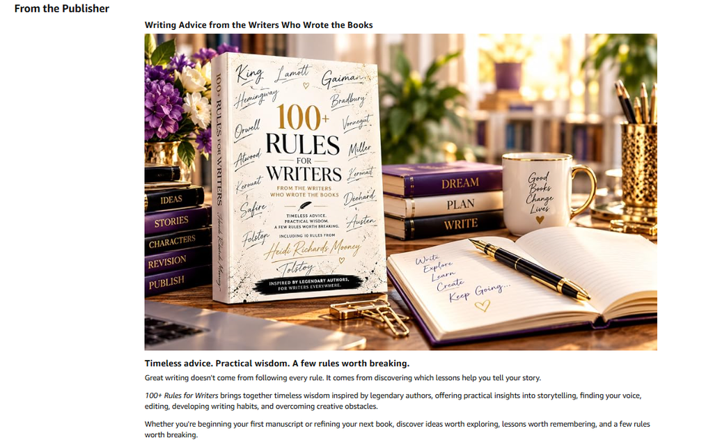
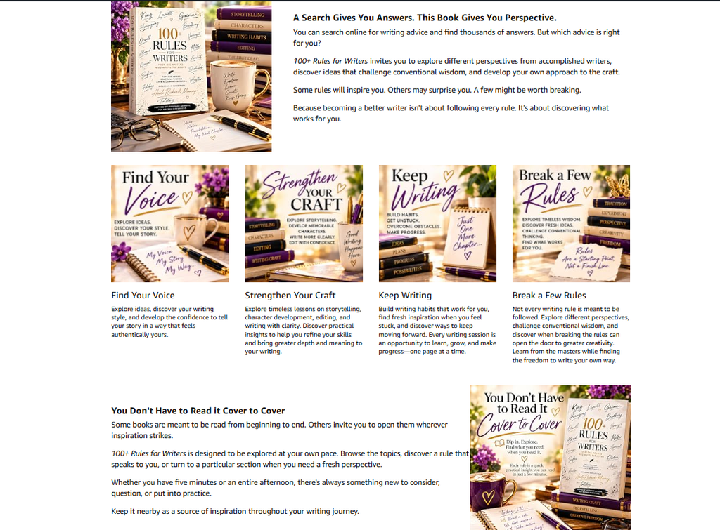
For 100+ Rules for Writers, my goal was to highlight the book's practical nature, its collections of writing advice, and the encouragement it offers writers at different stages of their journeys.
Rather than repeat the book description, I wanted to give potential readers a visual sense of what they would discover inside.
I created a coordinated presentation using five A+ Content modules, combining book-related graphics, headlines, and concise descriptions.
After submitting it to Amazon, I received the message every author hopes to see:
Congratulations! Your A+ Content has passed content review.
Amazon indicated that the approved presentation should appear on the book's detail page within 48 hours.
That was a satisfying milestone, especially because it was my first experience creating a complete A+ Content presentation.
Next: The Expectant Author
My second project was The Expectant Author, a guide that uses the metaphor of pregnancy and birth to help writers move from an initial idea to a finished, published book.
For this presentation, I wanted something warmer and more emotionally engaging.
We used imagery inspired by the book's cover and central metaphor: journals, writing desks, flowers, butterflies, and beautiful sunsets.
The presentation walked readers through four important stages of the author journey:
- Nurture Your Idea
- Develop Your Manuscript
- Prepare for Publication
- Deliver Your Book
These stages became a visual introduction to the book's approach.
I also wanted the final presentation to leave readers with a sense of possibility. After all, one of the messages behind The Expectant Author is that every book begins with an idea worth nurturing.
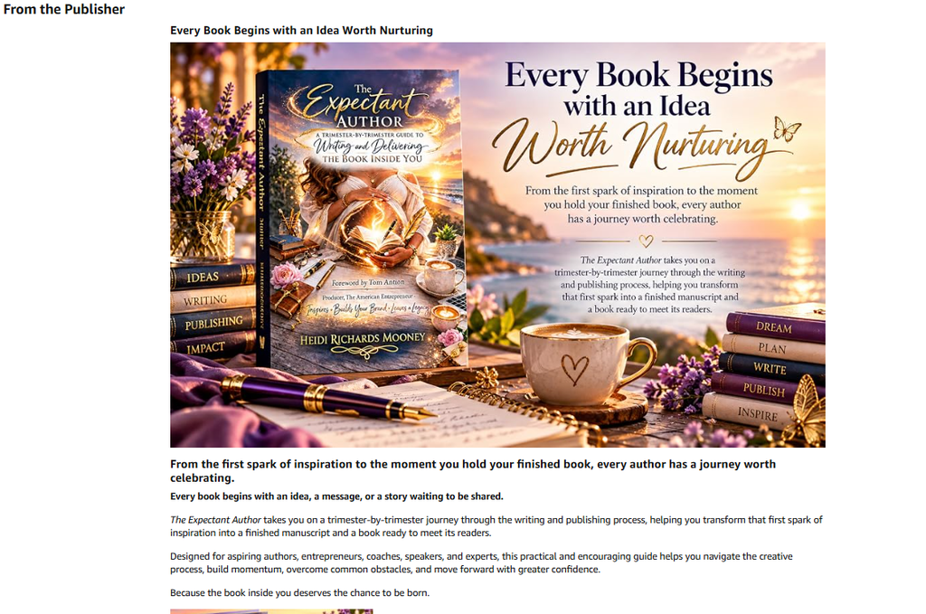
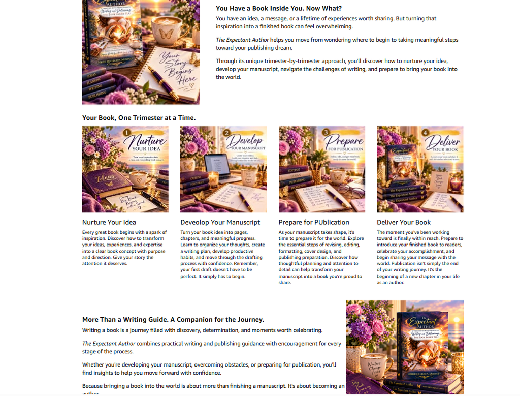
The good news is that both were submitted to Amazon for Review and 2 hours later both had been accepted. Although the approval message said content will appear within 48 hours, it only took about
2 hours for the images to show on the book pages.
One Feature, Many Creative Possibilities: A+ Content Doesn't Have to Look the Same
One of the things I discovered while exploring Amazon A+ Content is that no two presentations have to look alike. And that's part of what makes this feature so valuable for authors.
Some publishers use large, eye-catching banners with minimal text. Others incorporate photographs, illustrations, comparison charts, or a series of images highlighting the book's most important features. Some presentations are simple and understated, while others resemble miniature sales pages.
There's no single formula every author must follow.
For The Expectant Author, I wanted the presentation to reflect the journey of writing and publishing a book, using imagery and messaging that reinforce the book's trimester-by-trimester approach.
For 100+ Rules for Writers, the goal was different: introduce readers to the book's practical guidance, creative encouragement, and the value of having a collection of writing rules at their fingertips.
Two books. Two different messages. Two opportunities to tell a visual story.
The secret isn't to make your A+ Content look like everyone else's. It's to make it feel like your book.
Before choosing your modules, ask yourself:
- What makes my book different from others in its category?
- What would a potential reader want to know before purchasing?
- Which images, messages, or features would help communicate that value?
- How can I make the presentation an extension of my book's personality and promise?
A business book might benefit from diagrams or key takeaways. A cookbook could showcase beautiful food photography. A children's book might feature colorful interior illustrations. A novel could use atmospheric imagery to introduce its setting, mood, or themes without revealing important plot details.
And here's something worth remembering: A+ Content doesn't need to be elaborate to be effective. It needs to be relevant, readable, and useful to the reader.
Think of it as an opportunity to give your book a second introduction—one that goes beyond the cover and description to help readers imagine what awaits them inside.
What I Learned When Something Went Wrong
Not everything went smoothly.
While creating the presentation for The Expectant Author, I encountered a frustrating validation message:
“Content validation failed. Please fix the highlighted errors to proceed.”
The problem was that the message didn't clearly identify the offending field.
At first, I suspected the image dimensions. Some images were larger than the dimensions displayed in the module instructions. I experimented with resizing and exporting graphics through Canva.
But the problem persisted.
Eventually, I examined the preview more carefully and noticed that the text in my final image-overlay module extended beyond the available space.
The module was trying to display too much text over the background image. There was also text already embedded in the graphic, creating a crowded presentation.
I shortened the headline and body copy.
And suddenly, Amazon allowed me to proceed to the next step: applying the book's ASIN.
The lesson?
Sometimes the problem isn't the image. It's the amount of information you're trying to fit into the design.
I can't say with certainty which technical validation rule was triggered, but shortening that module resolved the error in my case.
It's a reminder that effective A+ Content is as much about restraint as it is about creativity.
Seven Tips for Creating Better Amazon A+ Content
1. Plan the Story Before You Design the Graphics
Don't begin by filling every available module.
First, ask yourself what a potential reader needs to know about your book.
What makes it different? What will the reader discover? Which ideas or features would benefit from a visual explanation?
Think of your presentation as a short visual journey, not a collection of unrelated advertisements.
2. Choose Modules That Serve a Purpose
Amazon offers a variety of module layouts, including large image headers, images paired with text, multiple-image arrangements, and comparison charts.
You can use up to five modules in a standard KDP A+ Content presentation.
A large banner might introduce your book's central promise. A series of smaller images could highlight key themes or sections. A final module might reinforce the book's main message.
You don't need every available feature. You need the combination that best tells your book's story.
3. Keep the Text Shorter Than You Think You Need
This was probably my biggest lesson.
Readers browsing Amazon aren't necessarily looking for another long article. They're scanning for information that helps them make a decision.
Use compelling headlines, short paragraphs, and clear language.
Avoid repeating the same message in every module.
And pay special attention to text-overlay layouts. What looks reasonable in an editing field may become crowded or unreadable in the finished design.
4. Design for Mobile Readers
A graphic that looks gorgeous on a desktop monitor may be difficult to read on a phone.
Use strong contrast, readable type, uncluttered compositions, and appropriately sized images.
Preview your presentation in both desktop and mobile formats before submitting it.
If your image already contains a headline, be careful about adding another headline through Amazon's text fields.
5. Make Every Image Earn Its Place
Beautiful imagery is wonderful, but it should also communicate something meaningful.
For nonfiction, consider illustrating a process, a concept, or a benefit.
For fiction, focus on the mood, setting, or themes without misleading readers about the story.
For a workbook, show the kinds of activities or learning experiences readers can expect.
And always make sure the imagery accurately represents your book.
6. Understand Amazon's Content Rules
Amazon reviews A+ Content and places restrictions on what authors may include.
For example, its guidelines prohibit customer reviews, prices, discounts, purchase commands such as “Buy Now,” external website links, and certain promotional or time-sensitive claims.
Images must meet Amazon's technical requirements, and image alt text should genuinely describe what appears in the image.
Before submitting, review the current guidelines rather than assuming that everything acceptable on your website or social media is acceptable in A+ Content.
7. Preview, Revise, and Save Your Work
Don't wait until the final submission screen to review your presentation.
Preview each module as you build it. Check for overlapping text, awkward cropping, repeated messaging, spelling mistakes, and inaccurate book-cover details.
Keep copies of your graphics and text in a dedicated folder so you can make adjustments later.
And if Amazon rejects your submission, don't assume you need to start over. Sometimes a small correction is all that's required.
How to Get Started with Amazon A+ Content
If you're ready to explore the feature for your own book, the process begins in your Kindle Direct Publishing account.
- Sign in to KDP and open the Marketing section.
- Find A+ Content, select your marketplace, and open Manage A+ Content.
- Start a new A+ Content project and give it an internal name.
- Select your language and add the modules you want to use.
- Upload your images and enter your headlines, descriptions, and image alt text.
- Preview your presentation and make any necessary adjustments.
- Select Apply ASINs to associate the presentation with the appropriate book edition or editions.
- Review the completed content and submit it for Amazon's approval.
Once approved, the presentation can appear on the applicable book detail pages.
Remember that A+ Content is marketplace-specific. If you want it displayed in multiple Amazon marketplaces, check the available options for duplicating and submitting your content in those stores.
Here are three official resources to help you find and add A+ Content to your books (provided they are available in your market):
- Amazon KDP: A+ Content overview
- Amazon KDP: How to Create A+ Content
- Amazon KDP: A+ Content Guidelines
Do You Need to Be a Graphic Designer?
Not necessarily.
You can use tools such as Canva to create coordinated images, prepare layouts, and resize graphics for different modules.
AI-assisted tools may also help brainstorm concepts, draft headlines, or develop visual ideas. Amazon itself offers AI-assisted creation options for eligible modules in certain marketplaces.
However, you remain responsible for checking accuracy, image rights, spelling, and compliance with Amazon's requirements.
This is especially important when using AI-generated images that include book covers or other text. Generated lettering may be incorrect, and small inaccuracies can easily go unnoticed.
My suggestion is to use your actual book cover whenever the cover is featured prominently, rather than relying on an AI-generated recreation.
The most effective presentation isn't necessarily the most elaborate one. It's the one that helps readers understand your book.
A Few Mistakes Worth Avoiding
As you begin planning your own A+ Content, keep these common pitfalls in mind.
- Repeating your entire book description. Use the extra space to reveal something different.
- Trying to squeeze too much text into an image. Shorter, clearer messaging usually works better.
- Ignoring mobile previews. Small text and crowded graphics can undermine otherwise attractive designs.
- Using inaccurate book images. Double-check covers, subtitles, author names, and other details.
- Including prohibited promotional language. Read Amazon's guidelines before submitting.
- Assuming bigger images are always better. Use the correct proportions and follow the requirements for each module.
- Forgetting to save your original files. Keep everything organized for future revisions or additional editions.
One More Way to Help Your Book Find Its Readers
As authors, we're constantly searching for ways to make our books more discoverable, more appealing, and more meaningful to the people we hope will read them.
Sometimes that means exploring an entirely new marketing platform.
Other times, it means making better use of opportunities already available where our books are sold.
Amazon A+ Content falls into that second category.
Creating these presentations for 100+ Rules for Writers and The Expectant Author reminded me that book marketing isn't only about attracting attention. It's also about helping readers make an informed, confident decision once they've discovered our work.
A well-designed presentation gives us another opportunity to communicate what our books are about, why we wrote them, and what readers may gain from opening their pages.
Your book has a story beyond the story inside it. A+ Content gives you another place to tell it.
And that makes it worth exploring.
Let's Talk About It
Have you created Amazon A+ Content for any of your books?
If so, what did you include, and what have you learned from the experience?
If you haven't tried it yet, what's holding you back: time, design skills, uncertainty about the process, or simply not knowing the feature existed?
NOte: Since I was testing the process, I used ChatGPT to help with images and layout of the content. It took about 2 hours to get that part accomplished (with my input and ideas for what to share). I did upload parts of my book including the introduction, table of contents and sample chapters so Chatty would be familiar with the book and make suggestions based on my actual books.
I'd love to hear your experiences and ideas.
More Readers. More Impact. Together.
The Author Collab™